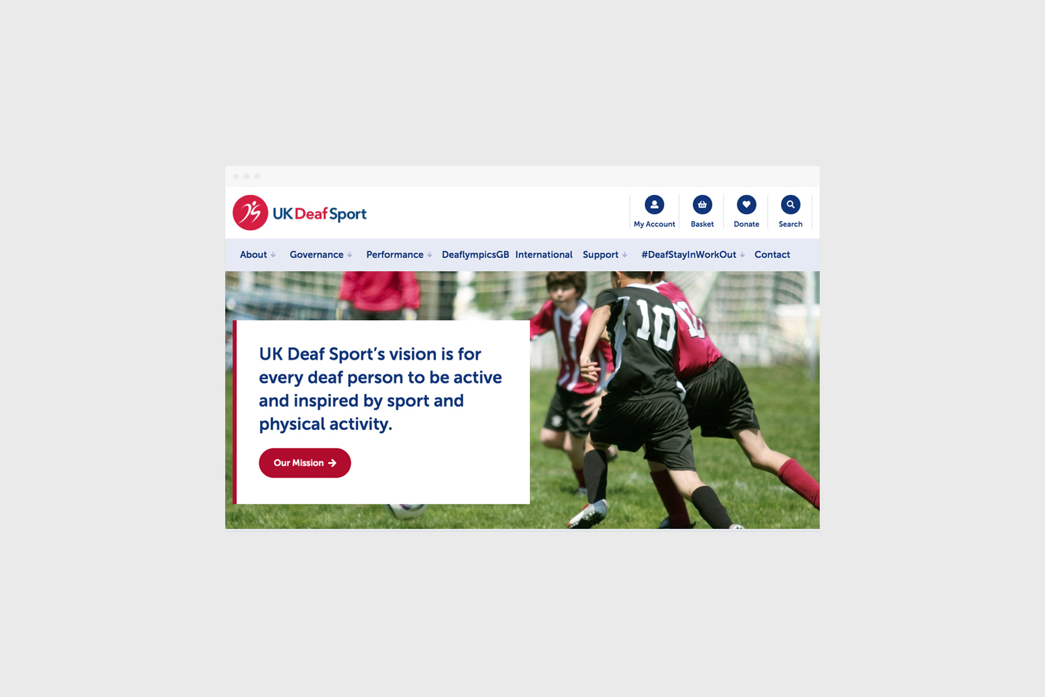
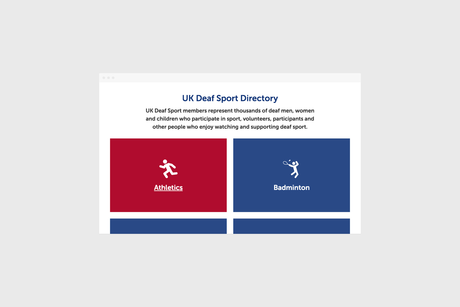
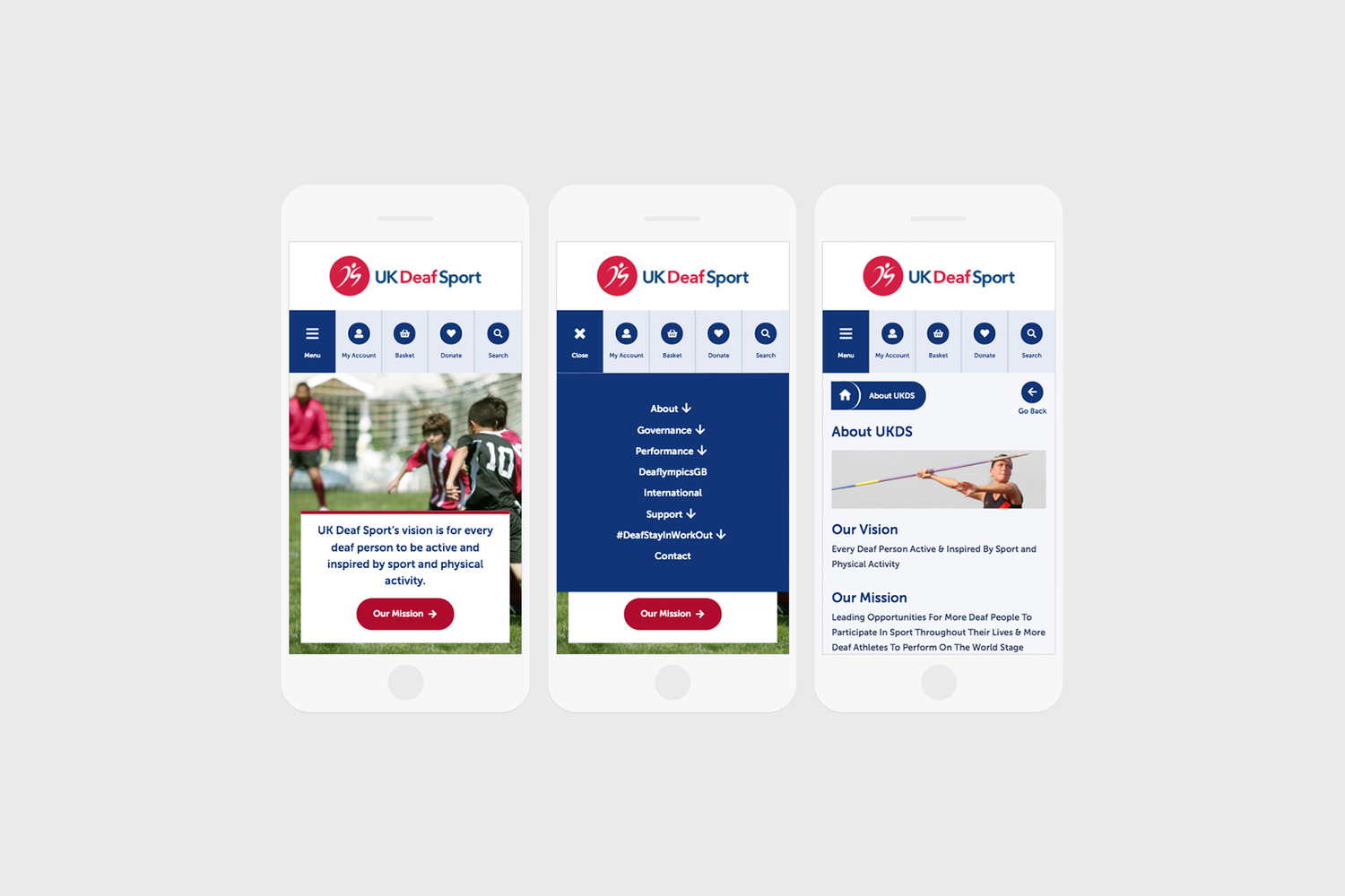
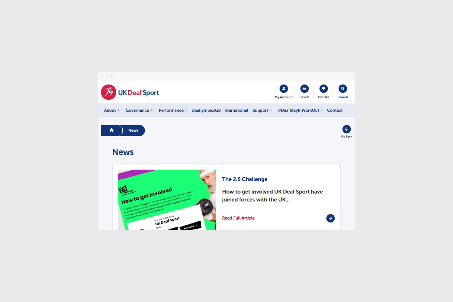
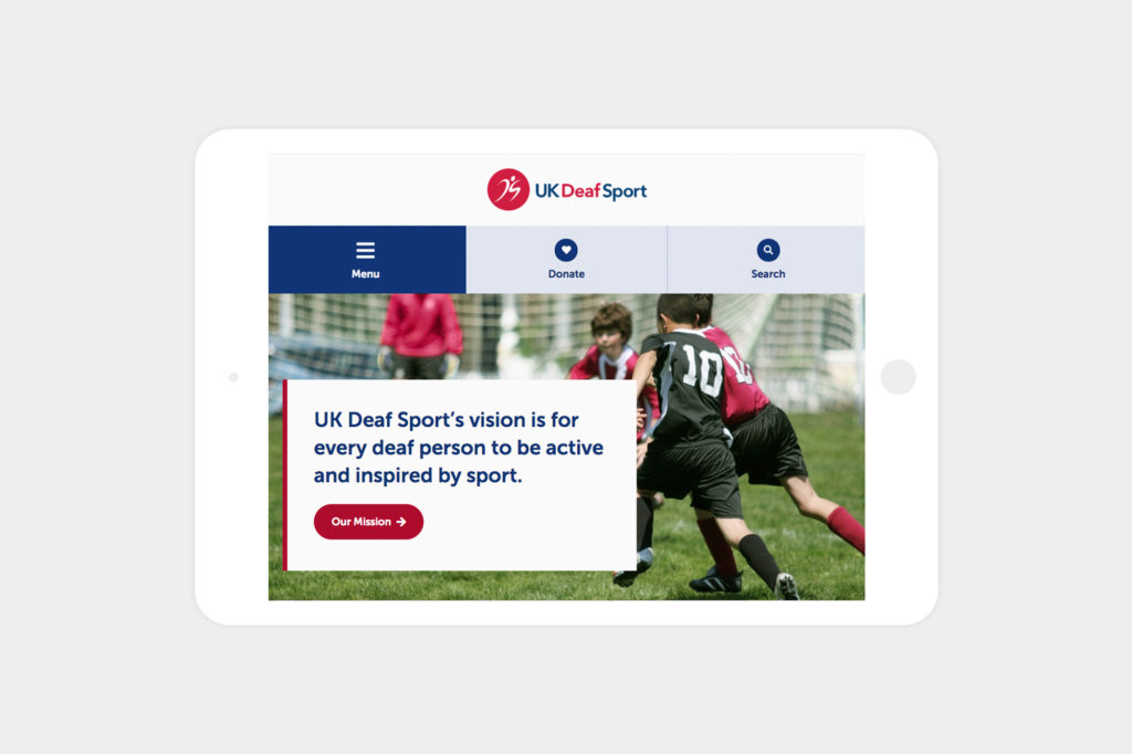
We created both the branding and online presence for UK Deaf Sport. Established in 2003, their aim is to encourage Deaf people to participate and excel at sport. The bespoke website which we created is both aesthetically pleasing and easy to use, we used the newly established colour scheme throughout the website to solidify their crisp new branding.
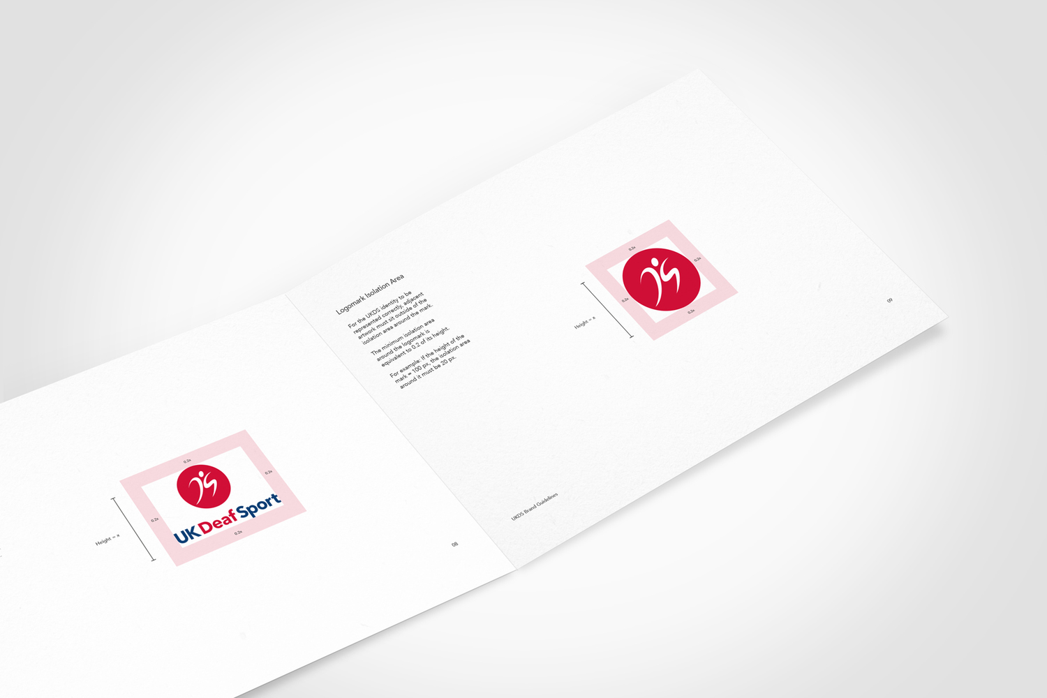
Our design for the UKDS logo creates the shapes of the letters D&S into a moving athlete. The colour scheme which we created is derived from the Union Jack to represent the United Kingdom based aspect of UKDS. The red, white and blue work well when representing a National brand, however we used softer tones across the blue and red to make it stand out further.
Along with the branding itself we also created Brand Guidelines for UK Deaf Sport, to ensure that their logo and visual appearance is used correctly to our design brief by all other media outlets. UK Deaf Sport have a clear Strategic Plan which outlines their vision and plans up to 2017, this makes our Brand Guidelines package specifically important for their future business development.
We’ve worked with several sporting communities, you can find out more about our work with other activity based organisations here. Look out for part 2 next week featuring Deafinitely Inclusive.