Now, we never like to be negative about others design work (unless of course, it is truly terrible!) but we have to say that the branding for this years Olympics is something we find… less than inspiring. However, we have found some alternative artwork which is fantastic. Sadly, this won’t be in official use for the games but that won’t stop us from admiring it.
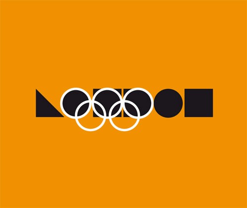
This Bauhaus inspired minimalist poster by Stuart Watson is stylish, eye-catching and inspiring. We love the bold colours and geometric shapes.
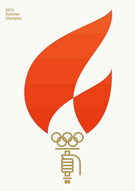
This pictogram style poster by Brent Couchman also encompasses a minimalist style and crisp understated colours.
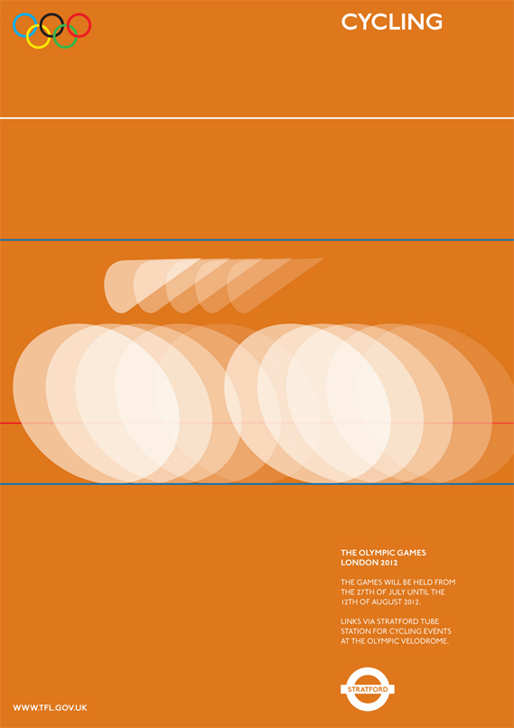
But our real favourites are these clean and classic poster designs by University College Falmouth student, Alan Clarke. Fantastic.

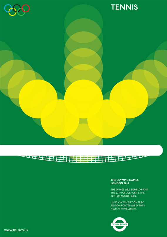
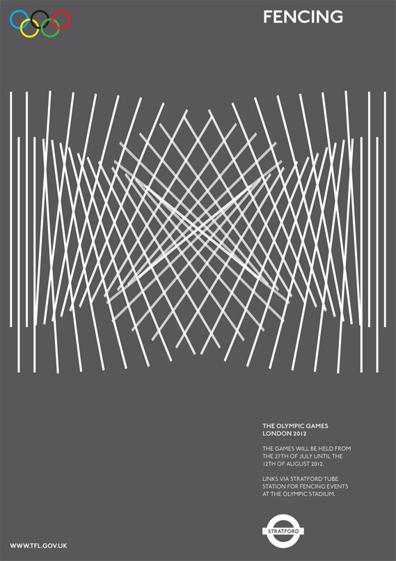
Designers take note, less is often more. Olympic organisers take note, however many millions you paid for that branding: you could have got it better, and cheaper, from a student.


