Menu
  • Home
  • Selected Work
    • Charities
    • Sporting Organisations / Local Authorities
    • E-commerce / Online Shops
    • Small Business / Entrepreneurs
    • Event Providers
  • About
    • Who we are
    • What we do
    • Get in touch
  • Our Services
  • Support
  • Book a Support Call
  • Contact Us
  • Selected Work
    • Sporting Organisations
    • Local Authorities
    • Charities
    • Event Providers
    • Small Business & Entrepreneurs
  • About
    • Who we are
    • What we do
    • Contact Us
  • Selected Work
    • Sporting Organisations
    • Local Authorities
    • Charities
    • Event Providers
    • Small Business & Entrepreneurs
  • About
    • Who we are
    • What we do
    • Contact Us
  • Service Locator
    • All Services
    • Support Service
    • Existing Customers
    • Email Support
    • Book a Support Call
  • 0333 344 8650
    • Call Now
    • Book a Support Call
    • Contact Us
  • Service Locator
    • All Services
    • Support Service
    • Existing Customers
    • Email Support
    • Book a Support Call
  • 0333 344 8650
    • Call Now
    • Book a Support Call
    • Contact Us
0333 344 8650
Google’s New Logo – Our Thoughts

Google has unveiled a new look just one month after internally restructuring the business. This is the biggest update to their branding for 16 years, and there’s been plenty of varied opinion surrounding it. Whether good or bad, there’s no doubt that people are talking about the new sans-serif Google.

There’s been mixed reviews in the studio, but overall we like the new Google. With many aspects of change, people don’t like it and are quick to criticise, but after time this can change. This update from Google reminds us of when Facebook relaunched their user interface, and lots of people grumbled over that. But now it’s not so much of a big deal, and people generally don’t remember (*cough* apart from us…).

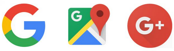
Google has lent it’s new G to all of its products and services, it looks great on Android devices. As time goes on the logo begins to make more sense.

Screen Shot 2015-09-07 at 09.29.15

Google’s decision to employ the sans-serif typeface simplifies the lettering, making it appear smaller and clearer on mobile devices. Their focus on online activity via smaller devices rather than desktop has grown. Perhaps this is in conjunction with their search algorithm update applied to mobile compatible sites back in April, you can find out more about this topic in one of our previous blogs here.

The new Google branding closely relates to the logo of their parent company Alphabet, whose homepage features the following:

Screen Shot 2015-09-04 at 11.37.09

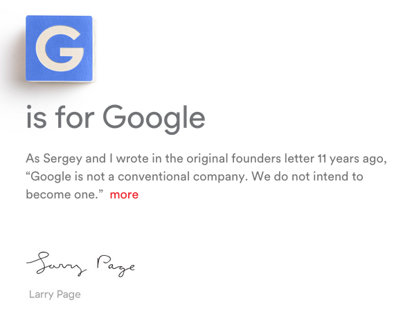
This quote is specifically highlighted in Alphabet’s unconventional URL abc.xyz.

No matter what we think of Google’s new logo, essentially it’s a sign that after the recent shake ups within the company structure, that they are ready for future changes and updates. If this means we begin to see more and more of Google’s innovation throughout the organisation, then surely this can only be a positive sign.

Embrace the change.

Fluid design

Our open ended design policy ensures we build the perfect digital experience for your business that looks beautiful and functions seamlessly across all devices.

Built for the future

All of our websites are developed on a flexible framework allowing our team to make swift changes to your website’s look to suit your current targets.

Monthly Payments

Our customers enjoy a monthly payment plan which means we can start building your new website without the need for any large upfront fees. 

Realise your digital potential

Get in touch with us today

Contact us

© 2023 adomedia

Privacy Policy | Instagram

iubenda Certified Silver Partner