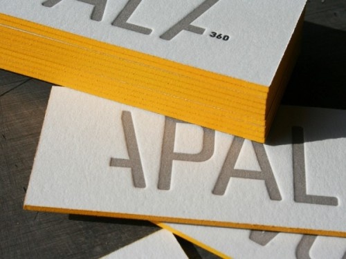
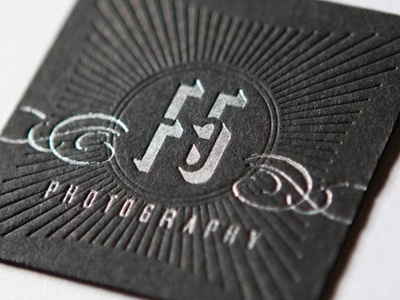
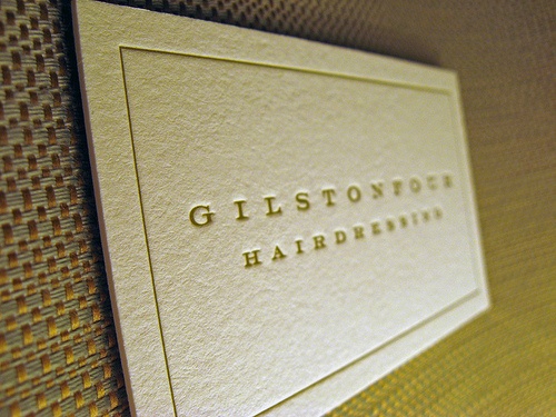
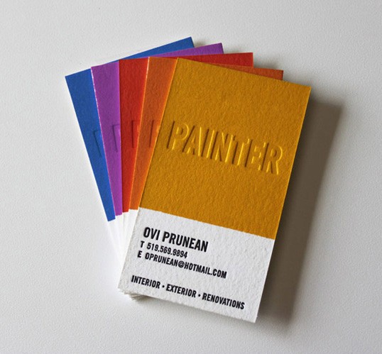
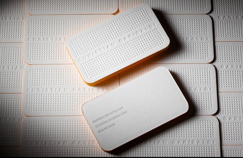
Texture is often overlooked when considering the design of your new business cards. However, the quality of the print stock and choice of print technique can and will make a huge difference to your business cards and stationary.
The main difference will be seen in the reaction of the recipient. Great print and design can take the reaction from ‘er.. oh thanks’ with a quick fumble into the pocket, to ‘oh, ooh these are nice’ a full inspection of the card and a careful placing into the wallet. A positive first impression, an etch on the memory.
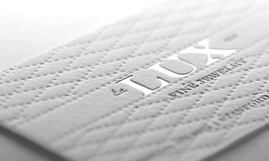
Letter pressed business cards are a great example. Not only do they look fantastic, but they are also tactile. The recipient’s subconscious instinct is to hold, feel and inspect them. In doing so, said recipient will take more time to soak up the information they provide. Bingo! your first hurdle is cleared, your card and thus your name and business will be remembered.
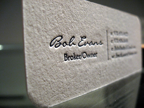
So sure, maybe you can go online and 500 business cards for 50p (or thereabouts) but is that the impression you want to give? Yes, they do the job. They provide a phone number and a name. If that’s all you want to achieve then why spend more?
However, in these times of tough competition and careful choices, giving a considered impression of quality and attention to detail may just be what sets your business apart. Call us biased, but cheap and lazy business cards give an impression of a business which is… well, you get the picture.
Whether you select bold colours, modern graphics or simple, classic and understated style, letterpress print is a fantastic option. Below are some of our favourite examples.
