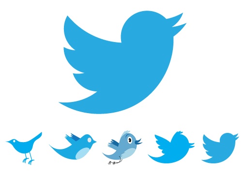
This month Twitter unveiled their new logo design. You may struggle to notice a huge amount of difference from the previous incarnation, to the untrained eye the changes are extremely subtle. Twitter’s designers haven’t exactly pushed the boundaries or taken a giant departure from their initial design, rather they have taken a step back and implemented an age old design principle – geometry.

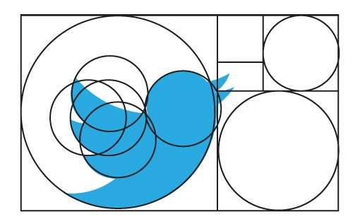
“Our new bird grows out of love for ornithology, design within creative constraints, and simple geometry. This bird is crafted purely from three sets of overlapping circles — similar to how your networks, interests and ideas connect and intersect with peers and friends. Whether soaring high above the earth to take in a broad view, or flocking with other birds to achieve a common purpose, a bird in flight is the ultimate representation of freedom, hope and limitless possibility”
In short, they have made use of the golden ratio, an ancient and extremely long winded theory that we won’t bore you with. Save to say that this principle of ratio, proportion and geometry is widely used in logo design although you may not have noticed it.

This perfect ratio can be found in architecture, art and even nature. It is said to give proportions that are most pleasing to the eye. When used in logo design, the effect is clear.

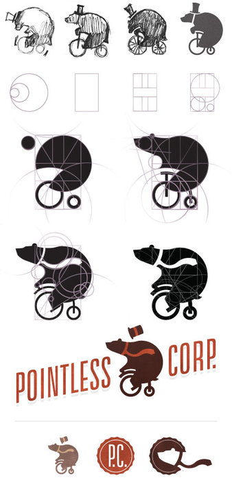
The Pointless Corp logo design process a great example of how a logo is developed and how the use of geometry and the golden ratio can create the most effective logos –

What do you think of the new Twitter logo? Did you notice the change? Do you love the clean lines or did you prefer the hand-drawn style of the older logos? Sometimes the most subtle change can offer a design with the biggest impact.

How’s your company logo looking? In need of a refresh or a little ‘golden ratio treatment’? Here at ADO towers we love a bit of logo design. Give us a bell, we will be happy to advise you.