As a smaller business, we feel that it is of great importance to look to larger and long established agencies for inspiration. A company we have long admired is legendary design consultancy, Pentagram. This incredible agency consistently create work which is fresh, diverse and forward thinking.
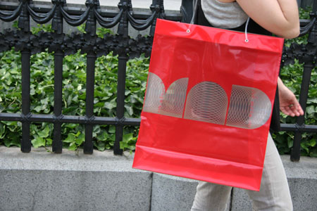
A great case in point is this identity created for New Yorks Museum of Art & Design. After relocating to the iconic building, no. 2 Columbus Circle following an extensive redesign, the museum decided that a new image was required.
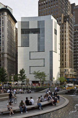
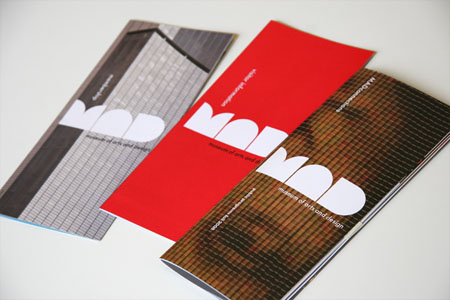
Pentagram faced a challenging brief to create an identity which is punchy and compelling, yet versatile enough to be used across all mediums from print, web and packaging, to bags, t-shirts and paraphernalia, on the sides of buses, on street banners, in print ads and in the subways.
Of course, pentagram rose to challenge with serious style, developing a logo which perfectly represented the iconic New York building and it’s new resident.
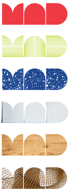
Not content with designing this superb logo, they also developed an entire typeface to use with it on all promotional items. Entitled MAD face, the new typeface can be seen throughout the museums new ID.
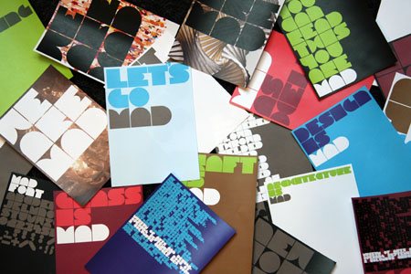
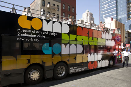
Although this project is not a new one, it is certainly a timeless one. This project is inspiring not only for our designers, but for our clients and business owners of all capacities. It is sometimes difficult to make a move from your established branding, but it can also be a move that, when executed well, can really pay off. Clinging on to tired old branding can be damaging. It is often a business owners apprehension that a new company look or branding will lose faith from established customers. We feel however, that if your new branding is done well, it can only be a great thing.
Hows your branding looking? feeling inspired to take on a fresh new look? Why not give us a call? We will be happy to advise you.