If you’re anything like us, you will be so over the Jubilee by now. Yes, we all enjoyed the bonus days off and that warm fuzzy feeling of national pride. But now we’re back at work and facing the horrible realization that those boozy bonus days have left us with a backlog of work to catch up on. Call us grumpy, but if we see another plastic union jack whipping around against the soggy grey sky, we may have to rip it down.
Retailers well and truly cashed in on the Jubilee celebrations, covering everything in sight with flags, crowns and our dear old Queens face. Whilst many of them are brash and obvious, some retailers really struck the right note. It positively warmed the cockles of our hearts when we laid our peepers on Kellogg’s limited edition vintage packaging during a weary trudge around Sainsburys.
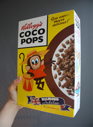

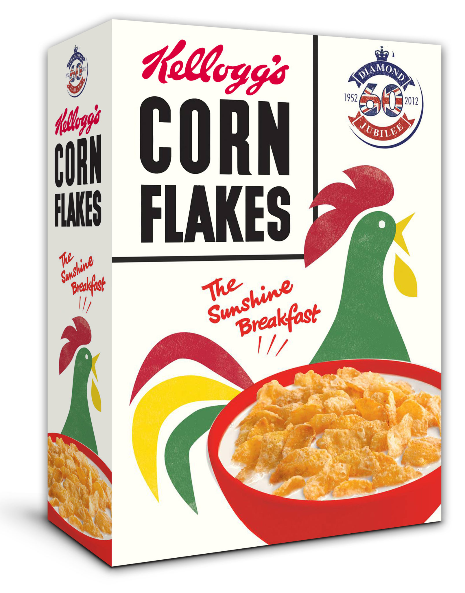
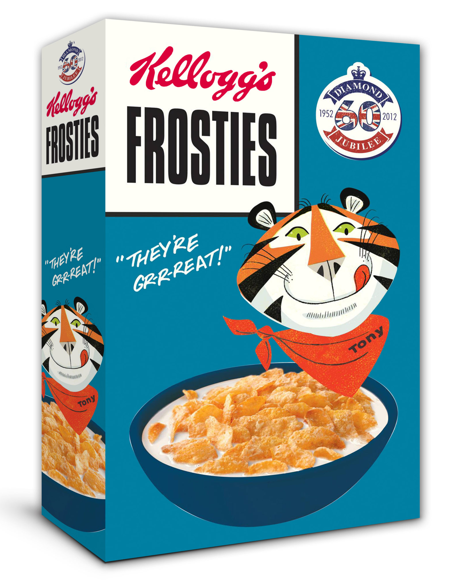
Using authentic Kellogg’s drawings dating back to the 1950s when the Queen ascended the throne, boxes will be on sale for a limited time only from 22 April 2012 to 25 June 2012. The boxes include the first Coco the monkey design and original Snap, Crackle and Pop characters, with Corn Flakes and Frosties also getting a makeover. We think they are a vast improvement on the current designs.
Other brands have also offered up some stylish Jubilee inspired packaging. Good old Marks & Spencer used the classic illustration of artist Phil Hankinson to create some fantastic packaging design for their cakes and biscuits.
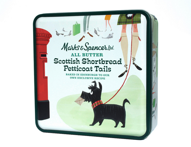
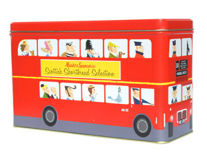
Other brands utilizing a classic vintage style include Kleenex, Cadburys and of course, that timeless and truly British institution, Fortnum & Mason –
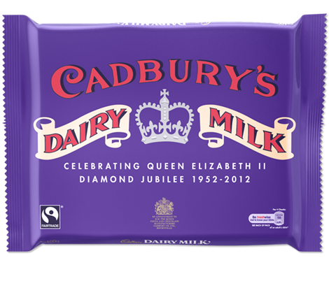
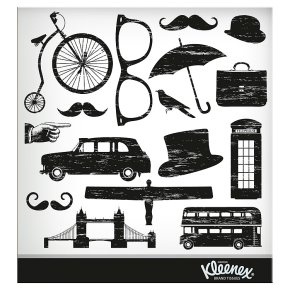
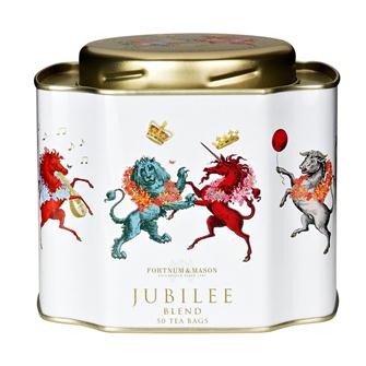
Far from the brash and cheesy designs many companies chose to adopt, these brands have saved the day. They have made the most of the occasion by selecting a distinguished approach, classic illustration and timeless design for their Jubilee promotions. Classic British style from flagship brands. Gawd bless em’.