Prohibition era America influenced branding for beer boutique Brewtique.
Website coming soon!
by adomedia
by adomedia
AniMates is a a professional dog-walking service based in Cheshire. The newly established company offers a wide range of services including puppy and elderly dog checks, home visits and dog taxi provision. Business owner Sophie Garner approached us to create her company branding and website.
Our design team created a clean, simple and striking logo which was conceived to appeal to the young professionals of the affluent Cheshire area. This design offers a modern feel which translates across a range of promotional mediums, from printed literature and stationary through to uniforms, vehicle livery and the company website.
As well as a lover of dogs, Sophie is a keen horsewoman. Her equestrian colours are black and pink, and she asked us to incorporate them within the company logo.
The AniMates website needed to be simple and easy to navigate, to appeal to Sophie’s potential clients who span a variety of age groups.
We developed a fresh and modern design with a focus on clean scrolling imagery and clearly labelled information.
You can view the full website at www.myanimates.co.uk.
by adomedia
We love a good branding exercise, and it goes without saying that we love a good beer. We also love local, independent business – you could say this job was right up our street. Quite literally in fact, the Brewtique store will be just around the corner from our studio.
Brewtique is a stylish new shop opening right here in Cheshire, specialising in artisan bottled beers.
We took a classic approach utilising slab serif typography reminiscent of 1930’s prohibition America, an era of artisan techniques. If you wanted a beer, you made it yourself!
We added a modern touch with sharp graphics and bold colours.
Brewtique is set to open later this summer.
by adomedia
by adomedia
We just love this beautiful identity design by Diogo Nascimento & Mariano Pascual for traditional preserved fruit and vegetables business, Monsieur Appert.
“Monsieur Appert, a preserved fruit and vegetables business with a French spirit that works with the tradition of the natural method and pays homage to the figure of the cook who has discovered the formula for preserving food: Nicolas Appert”
We think the design duo have really nailed this one. Beautiful vintage illustration combined with the bold, modern typeface and sharp, minimalist logo offer impact and timeless style.
by adomedia
by adomedia
This month Twitter unveiled their new logo design. You may struggle to notice a huge amount of difference from the previous incarnation, to the untrained eye the changes are extremely subtle. Twitter’s designers haven’t exactly pushed the boundaries or taken a giant departure from their initial design, rather they have taken a step back and implemented an age old design principle – geometry.
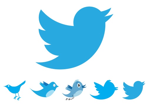
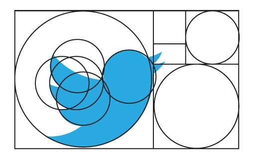
“Our new bird grows out of love for ornithology, design within creative constraints, and simple geometry. This bird is crafted purely from three sets of overlapping circles — similar to how your networks, interests and ideas connect and intersect with peers and friends. Whether soaring high above the earth to take in a broad view, or flocking with other birds to achieve a common purpose, a bird in flight is the ultimate representation of freedom, hope and limitless possibility”
In short, they have made use of the golden ratio, an ancient and extremely long winded theory that we won’t bore you with. Save to say that this principle of ratio, proportion and geometry is widely used in logo design although you may not have noticed it.

This perfect ratio can be found in architecture, art and even nature. It is said to give proportions that are most pleasing to the eye. When used in logo design, the effect is clear.
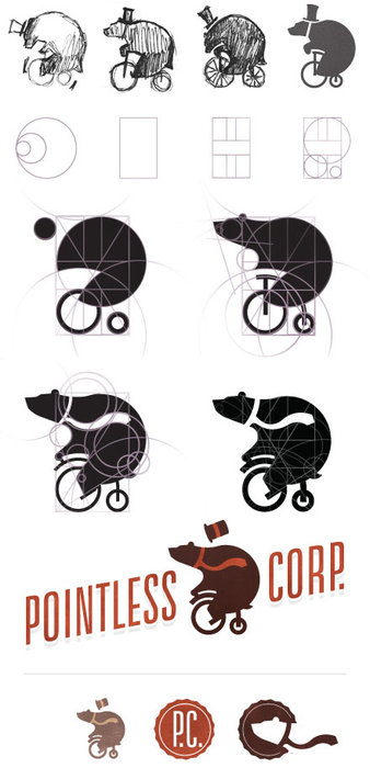
The Pointless Corp logo design process a great example of how a logo is developed and how the use of geometry and the golden ratio can create the most effective logos –
What do you think of the new Twitter logo? Did you notice the change? Do you love the clean lines or did you prefer the hand-drawn style of the older logos? Sometimes the most subtle change can offer a design with the biggest impact.

How’s your company logo looking? In need of a refresh or a little ‘golden ratio treatment’? Here at ADO towers we love a bit of logo design. Give us a bell, we will be happy to advise you.
by adomedia
As a smaller business, we feel that it is of great importance to look to larger and long established agencies for inspiration. A company we have long admired is legendary design consultancy, Pentagram. This incredible agency consistently create work which is fresh, diverse and forward thinking.
A great case in point is this identity created for New Yorks Museum of Art & Design. After relocating to the iconic building, no. 2 Columbus Circle following an extensive redesign, the museum decided that a new image was required.
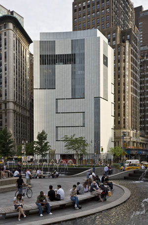
Pentagram faced a challenging brief to create an identity which is punchy and compelling, yet versatile enough to be used across all mediums from print, web and packaging, to bags, t-shirts and paraphernalia, on the sides of buses, on street banners, in print ads and in the subways.
Of course, pentagram rose to challenge with serious style, developing a logo which perfectly represented the iconic New York building and it’s new resident.
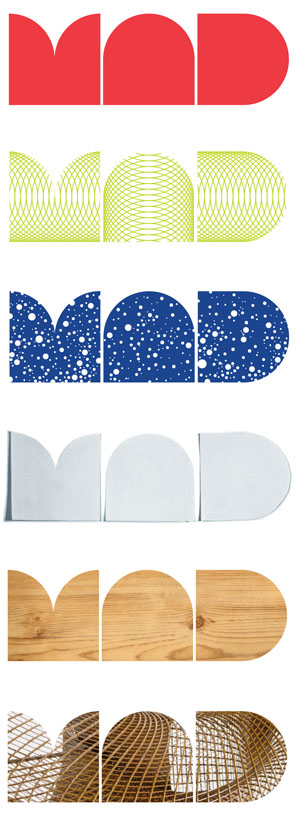
Not content with designing this superb logo, they also developed an entire typeface to use with it on all promotional items. Entitled MAD face, the new typeface can be seen throughout the museums new ID.
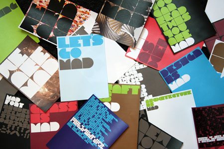
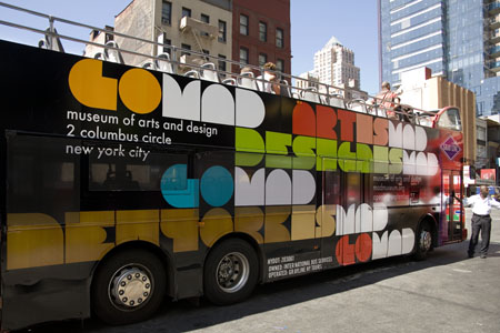
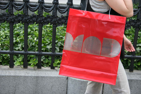
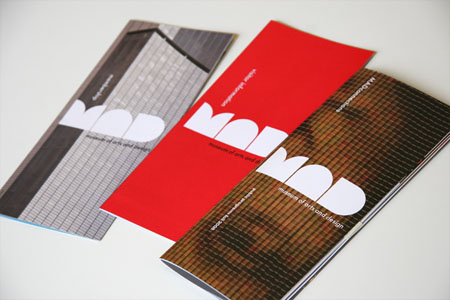
Although this project is not a new one, it is certainly a timeless one. This project is inspiring not only for our designers, but for our clients and business owners of all capacities. It is sometimes difficult to make a move from your established branding, but it can also be a move that, when executed well, can really pay off. Clinging on to tired old branding can be damaging. It is often a business owners apprehension that a new company look or branding will lose faith from established customers. We feel however, that if your new branding is done well, it can only be a great thing.
Hows your branding looking? feeling inspired to take on a fresh new look? Why not give us a call? We will be happy to advise you.
by adomedia
Corporate identity for Buxton B&B, Cotesfield Farm.
by adomedia
by adomedia
by adomedia
Corporate identity for tasty home cooking food blog, Nom Kitchen.
by adomedia
ADOmedia have just launched the new website for Macclesfield Counselling and Training Centre. The new site focuses on the events wing of their business and allows visitors to easily view and book places on the many courses, training seminars and conferences that they organise. Using a content management system the client is easily able to create events and set multiple pricing levels and attendance limits. The end result is a very clean and easy to navigate website that the client just loves – it has drastically reduced their admin time and this allows them to get on with the work they do best!
To view the latest produce from ADOmedia visit the site here – www.mctcevents.co.uk
by adomedia
Well, it has been a hectic couple of weeks for the team at ADOmedia. Not only have we got a number of juicy projects on the work board but we have recently relocated to our new studio space (about time, I hear you say!). We are now settled in and loving our new environment. As well as a purpose built, beautifully beamed studio, our new premises also boast a bright and airy conference / meeting area. Here are a few snaps to give you an idea of what it is like:
So, next time you are on Chestergate why not drop in and say hello? We may even make you a brew!
Our new address:
ADOmedia Ltd
12 Chestergate
Macclesfield
Cheshire
SK11 6BA
by adomedia
A.J Boon Butchers of Chelford is a long established, quality butchers offering a massive range of the best locally sourced meat and dairy produce in the area. Late last year ADOmedia was approached by the business to create a fully editable website that would allow for new customers to find out about their great products. We have just launched the website in conjunction with the design and print of a flyer that has been distributed locally.
To view our latest project please visit www.ajboonbutchers.co.uk.
by adomedia
Nom Kitchen is a new food blog which we have recently launched for Alex’s fiancée Hannah. As a keen cook Hannah has built up large number of great recipes that she has amassed over the years. The problem was that with so many to remember there were bound to be a few that slipped the memory net and were consigned to history.
Therefore, ADOmedia helped her create this tasty (no pun intended!) little website so that all her yummy recipes could be documented. The site is controlled by a content management system and allows her to easily add and update her posts with ease. The blog is full of simple to make, delicious home cooked recipes with photos to help the less confident chefs out there plus a lot more! Why not have a read and give it a go… go on, you know you really do fancy yourself as the next Ramsay / Lawson!
View the Nom Kitchen food blog here – www.nomkitchen.co.uk
by adomedia
Following on from the success of last years Blues At The Blues festival Macclesfield Town F.C. have decided to run an ongoing series of live music events under the umbrella branding of Rock At The Moss. ADOmedia won the pitch to develop the branding and have since designed the main logo and all the subsequent poster designs. With well known bands such as the fantastic Virginmarys and Black Bart already booked to play the events are going to be a superb night out for anyone with an interest in live music. I have a feeling you will probably see us down there having a head bang!
by adomedia
Flowskate, a company specialising in rollerblading tuition, has commissioned ADOmedia to design their new web presence.
We are pleased to announce that the site is now live. Be sure to sign up to their mailing list and check back regularly for all the new updates, tips, tutorials, pictures and videos that will appear over the following months. Go on, get your skates on!